Joshua Majado
Thesis Presentation
Collaboration
The importance of collaboration has been recognized as a crucial aspect of success in various fields, and it is being highlighted as the P.L.O. topic of discussion. Through collaboration, diverse perspectives and expertise are being brought together, leading to the development of innovative solutions and the achievement of common goals. In the context of the Friendly Faces brand, collaboration has played a vital role in shaping its identity and direction. The input and feedback of numerous individuals have been invaluable, and their contributions have been instrumental in refining the brand's vision and mission. Below are feedback from others along the way, and how they helped to shape the Friendly Faces brand.
*Red text indicates how feedback was incorporated or explains the rationale for not implementing it.
Bartley Argo: Design Research Feedback

Week 1: Foundation and Inclusivity Suggestions
1. Clarify Definitions: Clearly define "developmental disabilities" to avoid broad generalizations and use more inclusive language.
This was deemed unnecessary. The brand is for all teens looking for affiliation, regardless of disability.
2. Focus on Positivity: Emphasize how diverse experiences can enrich the community, focusing on confidence-building aspects.
3. Inclusivity Over Specificity: Broaden the scope to include anyone seeking connection, not just those with specific disabilities.
4. Avoid Therapeutic Framing: Position the group as a social network rather than a therapeutic intervention.
Focusing on positivity and inclusivity became the cornerstone of the brand. Every text and imagery was chosen or designed with this in mind.
5. Ensure features align with goals of fostering empathy and social interaction.
All features were chosen with the goal of fostering friendship
Week 2: Brand Voice and Tone
6. Connection, Diversity, and Friendship: Focus on these themes in messaging to create a supportive community.
7. Theme Selection: Choose themes that align with the community's goals, considering whether they resonate with the target audience.
8. Narrative Development: Craft a narrative that engages the audience, using storytelling that resonates.
Changes Made after Live Critique:
-
Shift in Theme: Changed to Hollywood blockbusters to create an engaging and inclusive narrative (addresses suggestion 7).
-
Brand Features: Bullet-pointed reasons the target demographic should trust Friendly Faces.
-
Imagery: Used visual patterns to reinforce the message of inclusivity and friendship.
-
Narrative Reimagined: Made more engaging and inclusive, drawing on the diversity of characters and storylines in Hollywood blockbusters (addresses suggestion 8).
Week 3: Look and Feel Board
9. Design Consistency: Emphasized the need for a cohesive approach to shapes and textures.The first month was hectic and all over the place, but by the time the Brand Playbook was finished, a very cohesive look and feel had been implemented throughout the brand.
10. Visual Elements: Suggested consistent use of elements like stars and thoughtful use of line quality.
11. Imagery: Emphasized community by consistently showing groups rather than individuals.
12. Unique Elements: Suggested using unique elements like socks instead of puzzle pieces for a distinctive brand identity.
Design Adjustments after Live Critique:
-
Horizontal Curved Lines: Integrated to balance high energy from bright colors and patterns (addresses suggestion 9)This theme was continued throughout all branding, featuring the horizontal rainbow curve.
-
Imagery Curation: Ensured no one is depicted alone, reinforcing the affiliation theme (addresses suggestion 11). No individual is featured alone in any elements of the Friendly Faces brand.
Week 4: Final Design Notes:
-
Masked-out People: Added for versatility in different scenarios.
-
Energy Patterns: Well-done and could work well as background elements or icons.
-
Typography: Use of Optima Regular font adds a crisp and confident feel.
-
Textures and Patterns: Have a tactile feel and work well together.
-
Color Palette: Diverse and consistent with a Hollywood blockbuster theme.
-
Overall Feel: The design has a technical, techno feel and conveys a sense of excitement and self-confidence.
Assignments Submitted


Suggestions Not Implemented
-
Using Socks as Unique Elements (suggestion 12): This suggestion was not incorporated into the final design.
While developing the brand, and designing assets, socks began to feel out of place and were removed from the brand completely. -
Avoiding Therapeutic Framing in All Contexts (suggestion 4): While the group is positioned as a social network, it is unclear if all therapeutic framing has been avoided in the final messaging. Concern was raised that the feature of Peer Support Groups might influence the design decisions, so it was decided to retain them but only mention them as a feature in the Bus-Stop Ad.
Summary
The development of the Friendly Faces brand underscores the importance of collaboration in achieving effective design and messaging. Through iterative feedback and critique, particularly from Mr. Argo, the brand has refined its identity and direction. Key design decisions, such as the use of horizontal curved lines to balance high energy elements and the consistent depiction of groups to emphasize community, were influenced by Mr. Argo's feedback, which also highlighted the importance of design consistency and thoughtful use of visual elements (Cox, 2011). The incorporation of unique elements and a cohesive visual identity has resulted in a distinctive brand that conveys a sense of excitement and self-confidence, aligning with the theme of belonging and connection.
List of the suggestions used in the development of the Friendly Faces brand include: 1.Focus on Positivity: Emphasizing how diverse experiences can enrich the community, focusing on confidence-building aspects. 2.Inclusivity Over Specificity: Broadening the scope to include anyone seeking connection, not just those with specific disabilities. 3.Avoid Therapeutic Framing: Positioning the group as a social network rather than a therapeutic intervention, although some therapeutic framing was retained in specific contexts. 4.Connection, Diversity, and Friendship: Focusing on these themes in messaging to create a supportive community. 5.Theme Selection: Choosing themes that align with the community's goals, considering whether they resonate with the target audience. 6.Narrative Development: Crafting a narrative that engages the audience, using storytelling that resonates. 7.Shift in Theme: Changing to Hollywood blockbusters to create an engaging and inclusive narrative. 8.Brand Features: Bullet-pointing reasons the target demographic should trust Friendly Faces. 9.Imagery: Using visual patterns to reinforce the message of inclusivity and friendship. 10.Design Consistency: Emphasizing the need for a cohesive approach to shapes and textures. 11. 12.Visual Elements: Suggesting consistent use of elements like stars and thoughtful use of line quality. 13.Imagery Curation: Ensuring no one is depicted alone, reinforcing the affiliation theme. 14.Horizontal Curved Lines: Integrating to balance high energy from bright colors and patterns. 15.Masked-out People: Adding for versatility in different scenarios. 16.Energy Patterns: Using well-designed patterns as background elements or icons. 17.Typography: Using Optima Regular font to add a crisp and confident feel. 18.Textures and Patterns: Having a tactile feel and working well together. 19.Color Palette: Diverse and consistent with a Hollywood blockbuster theme.
Adam Baldowski: Design Integration Feedback

Week 1: Initial Feedback on Logo Design
1. Preferred Designs: Mr. Baldowski likes designs 8, 9, and 14, particularly the simplicity and recognizability of design 14.
2. Vertical Text Concerns: The use of vertical text may be difficult to read, especially when viewed quickly.
3. Name Placement: Suggests exploring different placements for the name in the design but cautions against splitting it up.
4. Color and Shape Usage: The design's use of colors and abstract shapes conveys a sense of community and diversity.
5. Shape Cohesion: Suggests considering ways to connect the edges of the shapes to create a more cohesive look.
6. Design Exploration: Emphasizes the importance of exploring different design options and considering factors like psychology, line quality, and shape in the design process.
Week 2: Design Inspiration and Suggestions
7. Project Similarity: Notes that the design project is similar to one worked on last month and reminds him of the Sabon logo.
8. Inspiration Sources: The design seems to be inspired by heroes and Rangers.
9. Hand-Sketched Quality: Appreciates the hand-sketched quality of the design.
10. Human Faces in Design: Wonders if "Friendly Faces" should feature more faces of people and suggests exploring alternative versions that incorporate more human faces.
Design Decisions Affected by Feedback:
-
In response to feedback, options 8, 9, and 14 were identified as promising candidates for further development (addresses suggestion 1).
-
All designs featuring vertical text were eliminated due to readability concerns (addresses suggestion 2). Vertical text was not used at all in any of the designed assets.
-
After considering the suggestion to use actual faces in the logo (suggestion 10) An abstract logo was chosen as the preferred option.
Week 3: Visual Elements in Puzzle Design
11. Friendly and Balanced Design: Appreciates the format where the puzzle and text are stacked and aligned with the edges of the square, creating a friendly and balanced look.
12. Font Consistency: Suggests using the same font for both lines to create a nurturing and organic feel.
13. Layout Preferences: Prefers the stacked layout for its stability, while another design is seen as more friendly.
Week 4: Final Recommendations
14. Develop Page Design: Enhance the design to better connect with the established voice and tone.
15. Clear Space Guidelines: Use logo elements to represent clear space, ensuring guidelines are distinct and declarative.
16. Include Sizing Specs: Present sizing specifications for the logo.
Suggestions Not Implemented
-
Using Actual Faces in the Logo
(suggestion 10): Despite the suggestion to explore using actual faces in the logo, an abstract logo was chosen as the preferred option. -
Connecting Shape Edges
(suggestion 5) The shape edges were left unconnected in the logo, and the cohesive feel remained unaffected.
Assignments Submitted


Summary
The logo design process involved narrowing down options to 8, 9, and 14 based on week one feedback, which favored these designs and eliminated vertical text options due to readability issues. A suggestion to use actual faces in the logo was considered but ultimately rejected in favor of an abstract design, supported by sources such as Church Juice (2011) and Creativ | Brand Design (2019), which argue that non-literal logos can be effective in conveying a brand's identity. Additionally, Paper Lime Creative (n.d.) notes that literal logos can be overly simplistic and fail to capture a brand's essence. The abstract approach allows for greater creative freedom and the potential to develop a unique and memorable logo that encapsulates the brand's spirit.
List of feedback that was incorporated into the design: 1.Preferred Designs: Options 8, 9, and 14 were identified as promising candidates for further development. 2.Vertical Text Concerns: All designs featuring vertical text were eliminated due to readability concerns. 3.Name Placement: The suggestion to explore different placements for the name in the design was considered, and the final design does not split the name. 4.Font Consistency: The same font was used for both lines to create a nurturing and organic feel. 5.Layout Preferences: The stacked layout was preferred for its stability. 6.Develop Page Design: The design was enhanced to better connect with the established voice and tone. 7.Clear Space Guidelines: Logo elements were used to represent clear space, ensuring guidelines are distinct and declarative. 8.Include Sizing Specs: Sizing specifications for the logo were presented.
Andrea Kratz: Mult-Platform Delivery

Week 1
-
Use a range of graphical elements: Consider using different elements beyond just a logo to represent the brand, such as textures, color schemes, shapes, and patterns.
-
Improve the rainbow gradient: Use different portions of the rainbow gradient to avoid a gray spot in the center and create more visual interest.
-
Combine curved shapes with the rainbow gradient: Experiment with combining the curved shapes with the rainbow gradient to create a unique brand look.


Week 2
-
Incorporate curves for cohesion: Incorporate curves from the "little people" into all designs for a cohesive look. (Matches Suggestion 3 from Week 1)
-
Typography and background: Ensure the background doesn’t clash with the logo and use a round, friendly, and bold typographic choice. In the creation of the Friendly Faces brand, careful consideration was given to prevent the background imagery from obscuring the text. This is particularly evident in the design of the letterhead, where a textured pattern was incorporated and its opacity was adjusted to ensure that readability was not compromised.
-
Postal considerations: Research postal regulations to ensure designs comply with Optical Character Recognition (OCR) requirements. The mail system's OCR was researched, and adjustments were made to the envelope to ensure clear space for the OCR scanner.
-
Branding consistency: Maintain consistent design elements across platforms, like social media banners, for strong branding. Consistent design elements were successfully maintained across all platforms, including social media banners, to reinforce the Friendly Faces brand identity. This cohesive approach ensured a strong and recognizable brand presence throughout various online channels.
-
Professional presentation: Include professional-looking elements in your portfolio to elevate its appearance from student work to professional work. This is shown in the Letterhead, Instead of using Lorum Ipsum text, a letter from the founder is written to new Volunteers using the brand's voice and tone that is welcoming, friendly and inclusive.
Revisions After Feedback


Week 2 Assets


Week 3
-
Hierarchy of information: Create a clear hierarchy of information to prevent overwhelming the audience. Use headings, subheadings, and featurette boxes to organize content.
-
Brand statement: Update the original vision statement to a concise brand statement that reflects the brand's current positioning and core attributes.
-
Visual elements: Use consistent visual elements such as the rainbow color gradient, curved shape, and confetti-like pattern across different branded assets. (Matches Suggestions 1 and 3 from Week 1)


Week 4
No new suggestions were made in Week 4.
Summary:
Ms. Kratz's feedback and suggestions had a profound impact on the development of the Friendly Faces brand, leading to the creation of a cohesive and recognizable visual identity. The emphasis on creating a range of graphical elements beyond just a logo resulted in the development of three key elements: the rainbow color gradient, curved shape, and confetti-like pattern. These elements were consistently used across all branded assets, including the website, social media graphics, letterhead, bus stop posts, and swag items. The consistent use of these elements has helped to create a strong and cohesive brand identity that is instantly recognizable. The Friendly Faces brand now has a professional and celebratory feel that is consistent across all platforms.
First iterations. . .


Revised post Feedback. . .


List of the suggestions used in the development of the Friendly Faces brand include: 1.Use a range of graphical elements: Different elements beyond just a logo were used to represent the brand, such as textures, color schemes, shapes, and patterns. 2.Improve the rainbow gradient: The rainbow gradient was adjusted to avoid a gray spot in the center and create more visual interest. 3.Combine curved shapes with the rainbow gradient: The curved shapes were combined with the rainbow gradient to create a unique brand look. 4.Incorporate curves for cohesion: Curves from the "little people" were incorporated into all designs for a cohesive look. 5.Typography and background: Careful consideration was given to prevent the background imagery from obscuring the text, and a round, friendly, and bold typographic choice was used. 6.Postal considerations: Research was conducted on postal regulations to ensure designs comply with Optical Character Recognition (OCR) requirements, and adjustments were made to the envelope to ensure clear space for the OCR scanner. 7.Branding consistency: Consistent design elements were maintained across all platforms, including social media banners, to reinforce the Friendly Faces brand identity. 8.Professional presentation: Professional-looking elements were included in the portfolio to elevate its appearance from student work to professional work, as seen in the letterhead. 9.Hierarchy of information: A clear hierarchy of information was created to prevent overwhelming the audience, using headings, subheadings, and featurette boxes to organize content. 10.Brand statement: The original vision statement was updated to a concise brand statement that reflects the brand's current positioning and core attributes. 11.Visual elements: Consistent visual elements such as the rainbow color gradient, curved shape, and confetti-like pattern were used across different branded assets.
Colleen Cleveland: Measuring Effectiveness

Centralizing Your Brand's Identity
The Brand Playbook is a critical phase in establishing a cohesive and recognizable brand identity. It is a comprehensive guide that consolidates all essential elements of your brand into an accessible and easy-to-follow document. This playbook serves as a roadmap for consistently implementing your brand across all business aspects, including strategy, messaging, experience, and identity.
By integrating all brand assets, such as visual identity, messaging, tone, and brand voice, the Brand Playbook ensures that all stakeholders, including employees, partners, and vendors, are aligned with your brand's values, vision, and mission. This alignment fosters a cohesive brand experience, which is essential for building a strong brand reputation and trust with your audience.Key components of a Brand Playbook include:
By crafting a comprehensive Brand Playbook, you empower your team to maintain and promote brand integrity effectively, driving long-term success and recognition. This guide ensures that all brand elements remain consistent across all touchpoints and channels, strengthening brand recognition and building trust with your audience.


Ms. Clevlands Suggestions
-
Check if any pictures are squished:
-
I incorporated this suggestion by carefully reviewing the layout of my design to ensure that all images are properly scaled and not distorted. This involved checking the image sizes and adjusting them as necessary to maintain their original proportions.
-
-
Ensure the crease between pages doesn't cut through images or text:
-
I addressed this by carefully planning the layout of my design to avoid placing important elements near the crease lines. This included adjusting the positioning of images and text to ensure they are not cut off or obscured by the page folds.
-
-
Update the mood board as your style evolves:
-
I incorporated this suggestion by regularly revisiting and updating my mood board to reflect changes in my design style and aesthetic. This involved adding new images and elements that align with my evolving style and removing those that no longer fit.
-
-
Consider cutting out pictures to stand alone:
-
I considered this suggestion by evaluating whether certain images would be more effective as standalone elements rather than being integrated into the design. This involved experimenting with different layouts and deciding whether isolating certain images would enhance the overall visual impact.
-
-
Review your work as a creative director:
-
I incorporated this suggestion by taking a step back and evaluating my work from a creative director's perspective. This involved assessing the overall coherence and effectiveness of the design, ensuring that it aligns with the project's goals and objectives.
-
-
Ensure the work is polished before colleague evaluation in Week 4:
-
I addressed this by thoroughly reviewing my work for any errors or inconsistencies before presenting it to colleagues. This involved checking for spelling and grammar mistakes, ensuring that all design elements are properly aligned and formatted, and making any necessary adjustments to ensure the work is polished and professional.
-


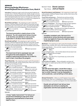
The self-evaluation form provided by Joshua Majado for the MDM640 course assesses his work in creating a brand playbook based on the guidelines provided in the Brand Playbook Guide. Here are the key points from his evaluation, supported by relevant sources: Brand Voice and Tone The brand's personality has been effectively expressed through words and phrases in the copywriting, reflecting the brand attributes and appealing to clients/stakeholders. The writing throughout the playbook uses inclusive, welcoming, and vibrant language, aligning with the brand vision board. A well-defined brand tone and voice are essential for engaging the target audience and building trust (ThoughtLab, n.d.). Brand Look and Feel The visual elements carry forward the brand vision board well, but could be improved by adding more images of teens throughout the book. Overall, the goal has been achieved, but there is room for enhancement. The use of consistent elements like gradients, patterns, and shapes throughout the book and in media assets contributes to a cohesive brand image. However, the visual hierarchy could be enhanced by tweaking alignment, proximity, and whitespace throughout the playbook. Proper use of visual hierarchy principles such as size, color, and alignment is crucial for effective design (Toptal, n.d.). The twelve basic principles of design, including contrast, balance, emphasis, proportion, hierarchy, repetition, rhythm, pattern, white space, movement, variety, and unity, are essential for creating visually appealing and functional designs. Visual Hierarchy The overall quality of the work in terms of visual design principles such as size, color, contrast, alignment, repetition, proximity, whitespace, texture, and style generally meets or exceeds the example. However, alignment, proximity, and whitespace could use improvement throughout the playbook. The principles of design, including contrast, balance, emphasis, proportion, hierarchy, repetition, rhythm, pattern, white space, movement, variety, and unity, are essential for creating visually appealing and functional designs. By incorporating these principles, the visual hierarchy can be enhanced to guide the viewer's attention and create a clear visual flow (Toptal, n.d.). Brand Consistency and Cohesion The playbook is very cohesive, using consistent elements like gradients, patterns, and shapes throughout the book and in media assets. The brand voice and tone, look and feel, work together effectively to convey how the brand would be communicated to the target audience. Consistency in branding is essential for building trust and recognition, and the use of consistent visual elements contributes to this consistency. Mechanics There are alignment issues throughout the book, and a lack of text compared to the examples. However, margins and gutter space are properly managed, and typography generally meets the criteria. Proper management of typography, image quality, and layout is essential for a professional-looking brand playbook. To create a successful website, it is crucial to define realistic goals, have an adequate budget, earn trust, stand out, and optimize for mobile (PixoLabo, 2024). Regular evaluation of content to ensure it remains relevant and current is also essential for maintaining a successful online presence. By incorporating these principles and addressing the areas for improvement, the brand playbook can be completed successfully and effectively communicate the brand's message to its target audience. Additional Considerations Creating a successful brand playbook involves understanding the principles of design and how they interact. This includes considering visual hierarchy, consistency, and cohesion, as well as mechanics such as typography and image quality. Furthermore, the importance of brand tone and voice cannot be overstated, as it plays a crucial role in engaging the target audience and building trust. The use of branded merchandise can also help improve brand recognition and create a lasting impression (Djordjevic, 2024). The seven visual elements of design, including line, shape, form, texture, pattern, color, and space, are essential for creating visually appealing and functional designs (Galvan, 2021).


Peer Feedback
The feedback provided acknowledges Friendly Faces' strong understanding of brand creation while offering specific areas for refinement. Here are some key points and suggestions for improvement:
Strengths
-
Brand Voice and Tone: Consistently praised for effectively expressing the brand's personality. Reviewers noted that it matches the brand's identity and is inclusive.
-
Brand Look and Feel: Recognized for being cohesive with the vision board, using bright colors and clear imagery that appeal to the target audience.
-
Consistency and Cohesion: The playbook is described as having strong consistency across pages, with a clear and cohesive flow.
-
Mechanics: Elements like typography, margins, and image quality are generally well-executed, ensuring readability and alignment.
Constructive Suggestions
Copy Density: One reviewer mentioned that some areas have too much copy, which could dissuade readers. They suggested scaling back to improve readability.
Bus-Stop Ad: The initial design had too much copy, which could have overwhelmed viewers. To address this, I significantly reduced the text in the Bus-Stop Ad and instead included a QR code that directs viewers to the Friendly Faces website. This allows interested viewers to access more detailed information in a more appropriate context.
Website Pages: While the copy was not removed or shortened, it was reorganized into bite-sized, easy-to-scan segments. This was achieved by adding headings, subheadings, and a textual hierarchy to aid in reading and comprehension. This approach ensures that the content remains accessible and engaging without overwhelming the reader.
Texture and Style: Another reviewer suggested adding more depth to background elements to enhance texture.
Texture and Style were enhanced by implementing background imagery like the rainbow gradient and pattern made from the 'Friendly Faces , abstract people logo element. Both are used Heavly
Playfulness in Text: With a voice and tone in place that is inclusive, welcoming, and vibrant, changing things could bring confusion and muddle the carefully crafted brand. Therefore, no alterations were made to the copy
The feedback acknowledges Friendly Faces' strong understanding of brand creation while offering specific areas for refinement.
List of the suggestions used in the development of the Friendly Faces brand include:1.Check if any pictures are squished: Ensured that all images are properly scaled and not distorted. 2.Ensure the crease between pages doesn't cut through images or text: Carefully planned the layout to avoid placing important elements near the crease lines. 3.Update the mood board as your style evolves: Regularly revisited and updated the mood board to reflect changes in design style and aesthetic. 4.Consider cutting out pictures to stand alone: Evaluated whether certain images would be more effective as standalone elements rather than being integrated into the design. 5.Review your work as a creative director: Took a step back and evaluated the work from a creative director's perspective to ensure overall coherence and effectiveness. 6.Ensure the work is polished before colleague evaluation in Week 4: Thoroughly reviewed the work for any errors or inconsistencies before presenting it to colleagues. 7.Copy Density: Reduced the text in the Bus-Stop Ad and reorganized the copy on website pages into bite-sized, easy-to-scan segments. 8.Texture and Style: Enhanced background elements by implementing background imagery like the rainbow gradient and pattern made from the 'Friendly Faces' abstract people logo element.
References
Breaking Down the Principles of Design (with Infographic) | Toptal®. (n.d.). Toptal Design Blog. Retrieved March 23, 2024, from https://www.toptal.com/designers/gui/principles-of-design-infographic
Church Juice. (2011). Logos Don't Have To Be Literal. Retrieved from https://churchjuice.com/blog/logos-dont-have-to-be-literal
Cox, P. (2011, November 17). Communication, Mood and Meaning: Lines in Web Design. Codrops. https://tympanus.net/codrops/2011/11/17/lines-in-web-design/
Creativ | Brand Design. (2019). Logos Don't Have to be Literal. Retrieved from https://www.iamcreativ.com/blog/2019/logos-dont-have-to-be-literal
Djordjevic, D. (2024, May 12). How merchandise helps brand recognition. Many Pixels. Retrieved from https://www.manypixels.co/blog/print-design/merchandise-brand-recognition
Galvan, M. (2021, May 26). 7 visual elements of design. Medium. Retrieved from https://uxplanet.org/7-visual-elements-of-design-bbd56eb063e9
Paper Lime Creative. (n.d.). Why You Should Avoid Literal Logo Design. Retrieved from https://paperlime.ca/literal-logo-design/
The Importance of Brand Tone and Voice: A Comprehensive Guide | ThoughtLab. (n.d.). Retrieved September 15, 2024, from https://www.thoughtlab.com/blog/the-importance-of-brand-tone-and-voice-a-comprehensive/
21 Essential Tips for Creating a Successful Website in 2024. (2024, May 24). Retrieved from https://pixolabo.com/essential-tips-for-creating-a-successful-website/